Gallery
Project Summary
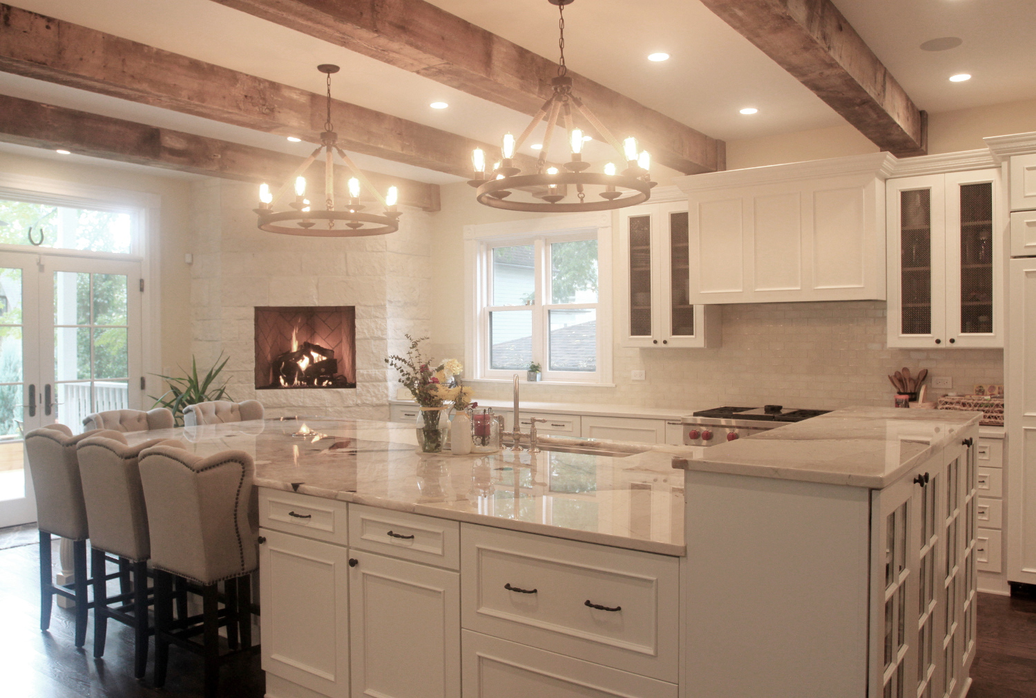
We expanded the original home with a two story addition to create a larger Kitchen on the first floor and add a Master Suite to the second floor.
Project Completion: 2016
Detailed Project Description
With a home built in the 1890s, the Owners were stuck with a kitchen that was deliberately isolated from the rest of the house because it was predominantly used by servants. But with the Kitchen being the center of the home now, significant changes were needed. The design brought together an expanded kitchen with stunning island and a gas fireplace to anchor the room along with French doors directly onto an expansive new deck to allow the kitchen flow into the back yard. The Kitchen was combined with a Craft Room, a Breakfast Nook with built in seating and new Mud Room as well as a new stair to the second floor. The difficulty was always linking the new space back to the original home, which was made up of three smaller, Victorian era rooms. The revelation that opened up planning was to switch the original Dining and Family Rooms, allowing the kitchen to flow directly into the Dining Room through a transition with a Wet Bar and generous Pantry. The space continues into the formal Living Room for a visual connection the full length of the home, uniting new with old. The Family Room was moved to the east side, where an addition creates generous informal space for the family. The addition also allows for a door directly onto an expanded, wrap around front porch that was also part of the project. Upstairs, a Master Suite was added along with a Laundry Room. French doors onto a balcony link to the back door off the Kitchen and give scale to the rear elevation.
Services Provided by CWDesign
- Addition & Renovation Design
- Deck Design
- Design of Front Porch Expansion
- Construction & Permit Detailing
- Historic Preservation Guidance
Project Partners
- Lee Ann Anderson assisted the Owners with Interior Design
Gallery
Project Summary
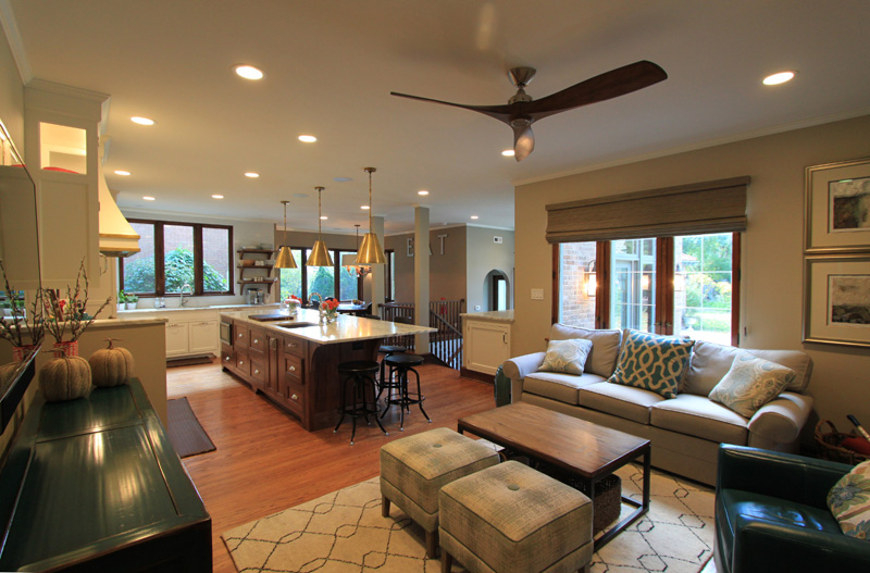
Turn of the century homes are beautiful, but often difficult to live in because they were built for a time when people lived differently. In this project, the goal is to adapt a wonderful old home to meet todays needs where the Kitchen is the heart of family life and a young family needs casual spaces in place of the formal spaces of old.
Detailed Project Description
Living in a turn of the century home can be a pleasure with its beautiful detailing and unique wood and plaster accents. But it can also be difficult, as homes from that era were not designed to fit the way we live now. In the case of this renovation, the existing kitchen is very isolated from the rest of the home and the first floor is composed almost entirely of formal spaces that make it difficult for a young and growing family to use and enjoy.
This renovation looks both to update the kitchen and also give it the space to be the hub of the family's activities. The first move was to create an addition so that the Dining Room could move adjacent to the Living Room. This opened up space for a large sitting area and breakfast bar adjacent to the kitchen. The second component was another addition that included a Breakfast Nook for more intimate family dining, an new Mud Room to accommodate the ever expanding amount of shoes and coats that a family uses, and a small Powder Room to better serve this new hub of the family.
Each of these additions was done with an eye toward carefully integrating the additions with the style of the existing home, mimicking both the massing and details that give the home its unique character.
In addition, these projects were paired with a Landscape Masterplan that gives the family a vision of how their new home will ultimately link to the yard. Plans included a new Patio outside the new living spaces to create seamless outdoor dining and entertaining. In addition, a new Screened Porch was also added between the addition and the existing Garage that will allow for the bug-free, three season usage we so often crave.
All told, the project will take a home from the 19th century to the 21st, with the internal amenities and spaces we need now, paired with a long term plan to integrate the yard and garden into the living spaces of the home.
Services Provided by CWDesign
- Design of Renovation & Additions
- Landscape Masterplan
- Project Renderings
Gallery
Project Summary
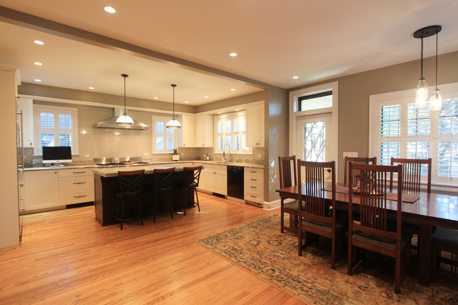
This home underwent a major change with a full second floor addition replacing cramped bedrooms under the sloping ceilings of the roof and a major renovation of the back of the home including a new expanded kitchen.
Project Completion: 2017
Detailed Project Description
Making a major addition to a home as iconic as an octagon bungalow is tough…especially when asked to put a full second floor on which can totally change the balance and proportion of the home. The design broke down the scale of the addition by creating a stepped roof line with a smaller bedroom at the front of the home transitioning from the octagon bay of the first floor to the larger mass of the full second floor beyond. The result maintains the prominence of the octagon while allowing for the expanded space the family needed. Inside the addition, three bedrooms and two baths (which include a full master suite) were added upstairs. The Master Suite includes a second floor deck that was added over an existing deck on the first floor. On the first floor, relocating the stair opened up the opportunity to create a generous great room with space for an expanded Kitchen, Dining Area and Sitting Area. The focal point of the Kitchen is a generous island centered on a beautiful range and hood, which is supported by a cavernous Pantry easily accessible from the kitchen. In a subtle nod to the history of the home and to hide some necessary utilities, the new stair takes an octagon shape reminiscent of the front of the home.
Services Provided by CWDesign
- Addition & Renovation Design
- Second Floor Deck Design
- Construction & Permit Detailing
Project Partners
- Mark Menna assisted the Owners with Interior Design
- Astor Builders was the Contractor
Gallery
Project Summary
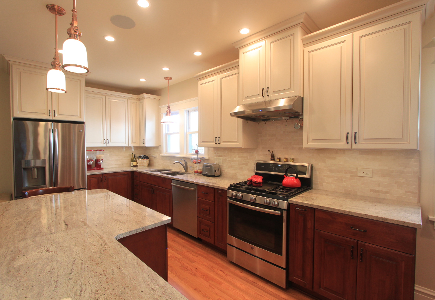
A full second floor was added to this quaint, single story bungalow along with a major renovation which expanded the kitchen on the first floor.
Project Completion: 2017
Detailed Project Description
With growing kids and a small home, this single story bungalow needed an addition. The natural place to do so was up given an existing walk-up attic that had a full stair already in place. The result was a second story addition that was limited to the back two thirds of the home both to manage costs but also to maintain the scale and massing of the original home as much as possible. The addition included a Master Suite which includes an office and also a second floor Sitting Area bathed in natural light. On the first floor, the existing master bedroom was added to a cramped kitchen and renovated into an open, inviting gathering place for friends and family with a breakfast bar and nook with television anchored by a central range and hood. In striving for a sustainable solution, the addition is fully insulated with spray foam to exceed local code requirements as well as being heating and cooled with a heat pump system that is exceptionally energy efficient.
Services Provided by CWDesign
- Addition & Renovation Design
- Construction & Permit Detailing
Project Partners
- Jill Warren Design assisted the Owners with Interior Design
- Jacknow Construction was the Contractor
Gallery
Project Summary
We rebuilt an existing enclosed porch that was structurally unstable which allowed for a kitchen expansion and the addition of a Master Suite to the second floor. The entry was also expanded with a small one story addition to allow for arrival and transition into the home.
Project Completion: 2018
Detailed Project Description
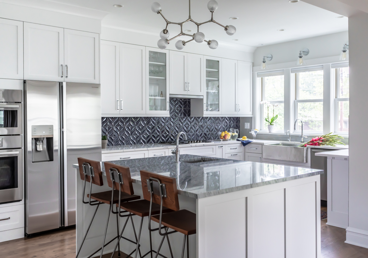
Facing structural problems with a two story rear porch, the Owners wanted to take advantage of the rebuilding to enlarge the kitchen and add a Master Suite. The result transformed a dark enclosed Kitchen with a single small window into an open plan that added an entire wall of glass while also sharing light from the Dining Room by removing an interior bearing wall. Simple but elegant white cabinets are accented with a hammered metal sink, dynamic blue tile and a large island with eye-catching pendant to create a space that is bright, inviting and unique. That work is paired with a new entry with the same emphasis on bringing natural light into all the living spaces by creating an open plan. What was previously cramped and dark is now generous and comfortable while keeping the addition in scale with the rest of the home. Custom built-in cabinets provide abundant storage with character. Upstairs, the new Master Bath is anchored by a free standing tub under large windows while a large shower and double vanity have clean lines and subtle textures to create an inviting, adult oasis. In addition, a renovation of the original bath updated finishes while also planning for a stackable washer and dryer to be added and simplifying life for the household.
Services Provided by CWDesign
- Renovation Design
- Construction & Permit Detailing
- Project Partners
Project Partners
- Jill Warren assisted the Owners with Interior Design
- Matt Jacknow was the Contractor
Gallery
Project Summary
This project was a total interior demolition and reconstruction with a two story addition off the back for an expanded Kitchen and Master Suite along with a rebuilt roof and attic space.
Project Completion: 2016
Detailed Project Description
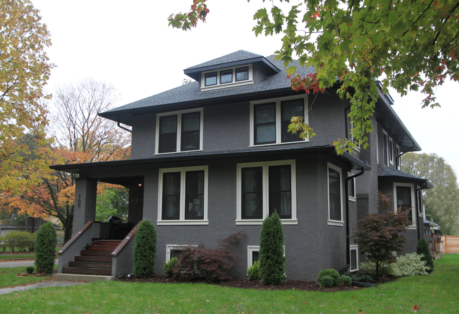
Having once been converted to a multi-tenant rental, this Gunderson needed to be fully rebuilt. We began with full scale demolition with the removal of all interior finishes. We continued with a reconfiguration of the back of the home which originally contained a dark and isolated kitchen along with a dilapidated screened porch. The kitchen was shifted closer to the living spaces into a new addition with the old kitchen being converted to a back entry and Mud Room. In its new position, the Kitchen opens directly to the rebuilt porch that was repurposed as a sitting area as well as to the relocated Dining Room and Wet Bar. The entire space was designed with extensive windows and sliding doors out onto the deck to bring the outdoors in and provide access to a newly designed deck for entertaining outside. In addition, more walls were opened up to create a free flowing plan with access directly into the adjacent Living Room and Entry. On the second floor, a Master Suite was added in the area of the kitchen addition. Space includes a Juliette balcony directly off the bedroom, another covered porch off the bedroom entry and a generous Master Bath. A separate kids’ bathroom and laundry room was also included in the renovation while maintaining the existing three bedrooms. The roof was then rebuilt with added dormers to create office and guest space with vaulted ceilings and extensive daylight. Finally, the exterior was refinished with new stucco and windows on the exterior, along with a rebuilt entry porch and newly designed back entry.
Services Provided by CWDesign
- Addition & Renovation Design
- Deck Design
- Construction & Permit Detailing
Project Partners
- Crooked Oak did the Interior Design and built the cabinets
- Irish Oak was the Contractor
Gallery
Project Summary
This project expanded an existing two car garage with an addition to house a new, multi-purpose recreation room. The goal was to add interior space that respected the character of the existing garage and home while also not overwhelming the yard.
Project Completion: 2017
Detailed Project Description
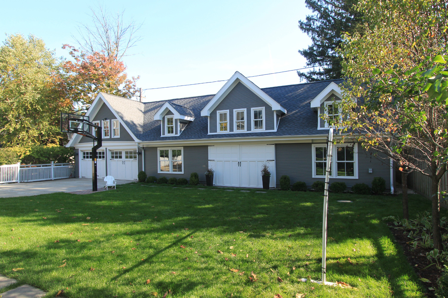
In desperate need of play space for three active kids in the winter, the Owner requested an addition to their existing two car garage primarily to house a basketball court complete with three point line, batting cage and tennis hitting wall. The solution was created in the language of the existing home and garage, both of which are contributing structures to the local historic district, using pitched roofs with gabled dormers. Detailed section studies also allowed for a layout with a single story facing the home to maintain good scale to the yard while using the dormers strategically to get the required ceiling height for the basketball court while also introducing abundant natural light into the space. Interior details like wire mesh over windows and wood hitting wall are done in clean lines to provide function without compromising on aesthetics. In addition, with sliding barn doors to the back yard the space can be equally inviting for large gatherings like graduation parties and extended family get-togethers.
Services Provided by CWDesign
- Addition Design
- Construction & Permit Detailing
Project Partners
- Construction by Brett Williams with ElementWorx
Gallery
Project Summary
This kitchen renovation also included an addition to expand the kitchen while also providing some casual seating and a powder room. The planning included integrating a deck into the design as a link between the inside of the house and the backyard.
Projected Completion: January 2013
Detailed Project Description
With a home defined by a very distinct architectural style, the Owners wanted redo the kitchen more in line with that unique identity. In doing so, they also wanted to expand the kitchen both to make it more responsive to today's cooking needs, while also providing space for others to gather and join the cook during preparations. The result is a small addition that allows for a breakfast bar, a small seating area and also a descreet powder room.
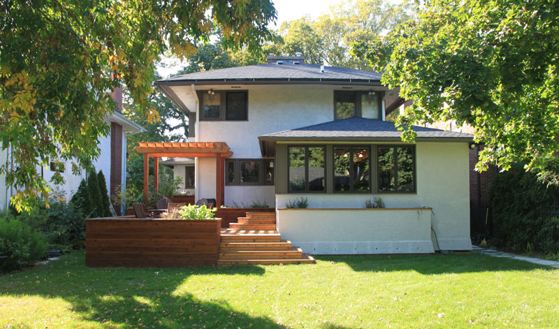
The adjacent seating area welcomes the morning sun with extensive glazing to the east and south, making it an ideal spot to sit down and enjoy a cup of coffee. Immediately outside the windows, a raised planter brings the garden up and directly into view. In addition, large double paned windows can be opened to almost make the wall disappear and make that connection even more tangible.
That link between inside and out is further enhanced by the planning of the deck itself. It is made up of a series of levels wherein the connecting stairs can be used as seats in and of themselves. Planters were again integrated at various heights to bring the sense of the garden right up to the house. The result provides a wonderful progression from the kitchen through a casual inside space to the generous space of the deck and the yard beyond - a sequence in which its hard to imagine not finding just the right niche to fit your mood.
Detailing throughout carefully matches the existing home as existing molding profiles and stain colors were carefully matched. At the exterior, copper caps in the front of the home were replicated at the side entry and raised planter in the back. The result is an addition that ties on to the existing home on several levels and integrates the new with the old.
Sustainable Characteristics
- Abundant natural light & Integrated plantings throughout the design
Services Provided by CWDesign
- Design
Before
Gallery
Project Summary
This homeowner was looking to replace a small, old deck with a new outdoor living space that would more readily accommodate larger groups of friends while also keeping enough room in the yard for their young son to play.
Detailed Project Description
Having just completed several interior renovation projects, this homeowner started looking toward making their back yard a more inviting extension of their home. The goal was to provide both table and casual seating in a space that would be intimate if it was just the family while also accomodating larger groups for entertaining. They also have a young son who needs space to play.
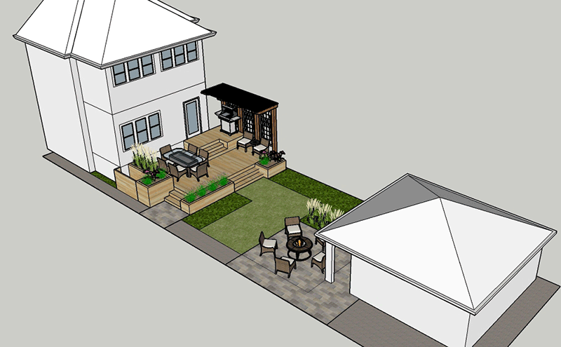
The resulting design studied two distinct options. The first was a deck that combined an upper level with an easily accessible bbq with an intermediate level that included both a table and some casual seating. It uses planters at various levels to both minimize railings (which can be an unwanted barrier) in favor of a more gradual transition to the garden. While the balance of the back yard would be largely grass for the son in the short term, the plan also included a second phase. The next layer of work would be a patio connected to the garage with large sliding doors. This would provide for a larger casual seating area, perhaps with a fire pit. The large sliding doors also provide a strong link to the interior of the garage, which could be used for additional seating or food service while entertaining.
The second option focussed a patio with a low, stone knee wall. That wall both provides definition and intimacy to the table area while also creating overflow seating for guests. This also includes a small deck at the level of the house with an easily accessible bbq and some casual seating where a morning cup of coffee can be enjoyed without running up and down the stairs.
Both options also include a new pergola and screen wall to the north. As the door from the kitchen is immediately adjacent to the neighbors property to the north, this vertical element helps provide both some visual screening while also providing an opportunity for climbing vines to soften the built elements of the home.
Services Provided by CWDesign
- Design
- Computer Modeling
Gallery
Project Summary
This project converted what was previously a shared bathroom off a hallway to a dedicated master bathroom and took an old 1950s era color scheme and gave it new life.
Detailed Project Description
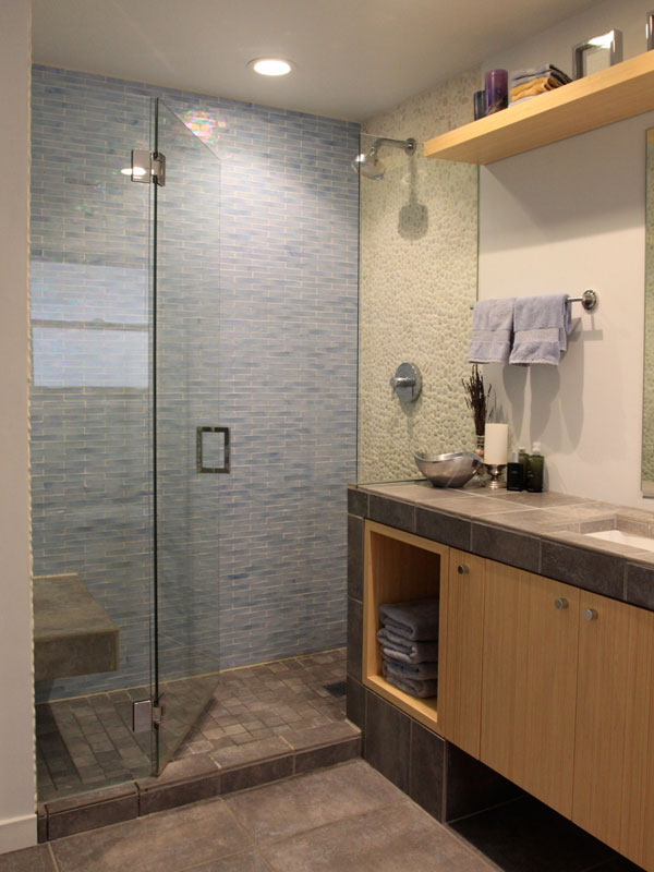
The layout included adding a stand-alone shower and a dedicated bathtub. Subtle design decisions included making the floor, tub surround and countertop the same material to make the relatively small bathroom seem larger. This was further reinforced by floating the cabinet of the lavatory which allows the flooring to extend underneath and further stretches the sense of space in the room.
Sustainable Characteristics
- LED Lighting
- Bamboo Cabinetry
- Dual Flush Toilet
- Reclaimed Wood Framing and Doors
- Increased Daylighting
- Recycled Bluejean Insulation
- Services Provided by CWDesign
Architectural Design
- Construction - rough & finished carpentry, electrical and tiling
Gallery
Project Summary
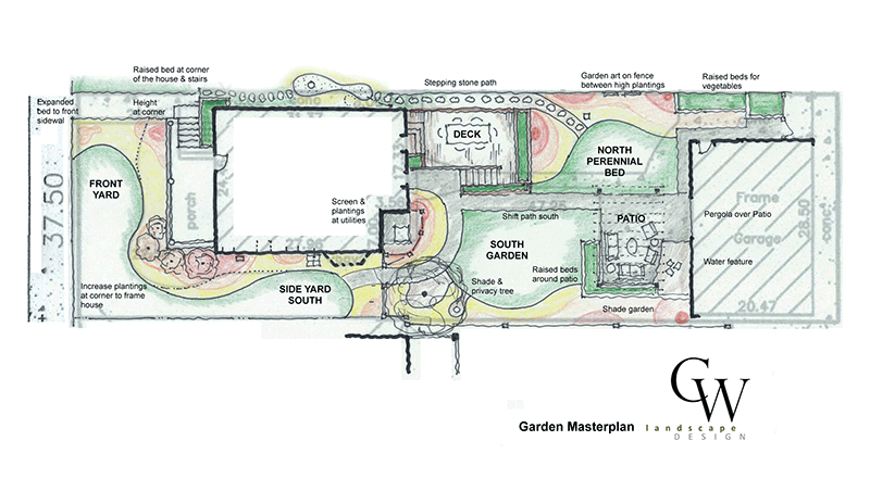
This Masterplan represents how a garden with little other than grass and some basic hardscaping can be quickly studied to define use areas and help guide subsequent projects so that all is done with a larger goal in mind.
Detailed Project Description
A backyard with little more than grass and an existing patio gave the homeowner a blank slate to begin. That patio was kept, but supplemented with raised beds, a water feature and a pergola to create more definition and intimacy. Other raised beds were added to the north of the garage for a vegetable garden - keeping them easily accessible to a bit out of primary views. A new shade tree gives definition to the front corner of the yard and also screens the view of a neighbor with an overlooking porch. The final element is a deck which shifts the eating area closer to the home and allows the original patio to become a casual seating area with a fire pit.
Sustainable Characteristics
- Reuse of large areas of the existing hardscape
- Raingarden on the north side of the home will accept water from a downspout that currently is connected to the sewer
CWDesign Services Provided
- Design
Existing Conditions
Gallery
Project Summary
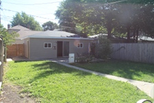
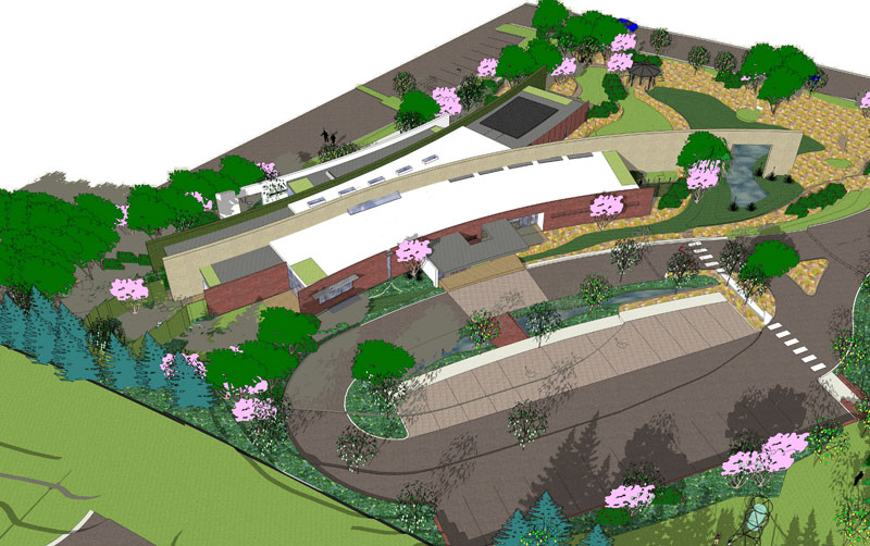
This new facility of almost 10,000 square feet was a recent addition to the campus of Ottawa Regional Hospital. It is an outpatient facility conceived to take advantage of nature's healing powers, while also defining a new level of sustainable building practices for the area.
Detailed Project Description
This project seeks to use the building as both an analogy to, and to assist with, the treatment taking place withing. Two masonry walls form the base of the design. They anchor the building to the ground to create a sense of permanence while extending it out into the site to engage the landscape. They create privacy while creating a sense of place and belonging. And they establish layers within the building that define public from private, shared from personal space.
These walls are, in many ways, analogous to the treatment taking place within where only through building security and trust can treatment begin to peel away the layers of protections that isolate and affect the clients.
Sustainable Characteristics
- This project will be applying for LEED Platinum certifications. Features include:
- Siting that minimizes the site disturbance and orients the building to provide the best solar relationship.
- A layered shaping that opens the building interiors so that all regularly occupied spaces, including circulation, have access to views of the exterior and to natural daylight.
- The site development uses native plantings with vegitated bioswales to clean the rainwater and encourage it to infiltrate on-site.
- The building envelope has been carefully designed with high insulation values. Windows were also designed to be operable for natural ventilation, and are also shaded with louvers that not only minimize unwanted solar gain while also providing privacy to clients.
- Building systems included photovoltaics, wind turbines, solar hot water and geothermal heating and cooling -- all of which help this building minimize its energy footprint.
Services Provided by CWDesign
- This project was completed by principal Chris Wollmuth as an employee of of Serena Sturm Architects, Ltd. His role was that of Lead Designer and Project Architect.
Gallery
Project Summary
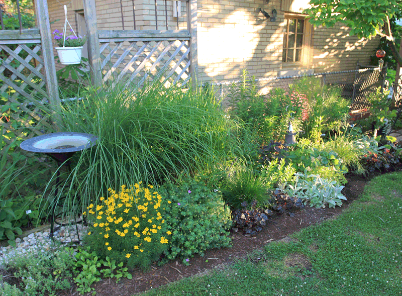
This homeowner requested a planting bed that was colorful throughout the season. The design accomplishes this goal while also carefully selecting plants known to attract butterflies.
Detailed Project Description
This homeowner wanted more color than the original yard which consisted of lawn and a row of bushes. The theme selected was a butterfly garden. The result is a colorful blend of native and drought tolerant plants that provide color throughout spring, summer and fall and are specifically selected to attract butterflies. In addition, clematis climbing on wire guides grows up the garage to soften the built form in this small garden.
By removing the shrubs for the new garden, however, the yard was left too exposed to the neighbors. The solution was the design of three custom screens which filter views to the neighbors. Their design allows both for neighbors to see one another and for conversations to take place across the property line while maintaining a degree of privacy for both families. The built forms of the screens also provide a nice contrast to the more fluid forms of the plantings. The trellis and copper pipe construction also allows vines to climb the screens, further uniting built and planted forms.
Sustainable Characteristics
- Largely native plantings complemented by drought tolerant varieties creates a garden that will require minimal watering
- A cistern collect rainwater from the garage roof for use watering annuals
- A rock filled drainage swale takes water from downspouts away from the home and disperses it to the garden
Services Provided by CWDesign
- Garden Design and Installation
- Yard Screen Design and Construction
Gallery
Project Summary
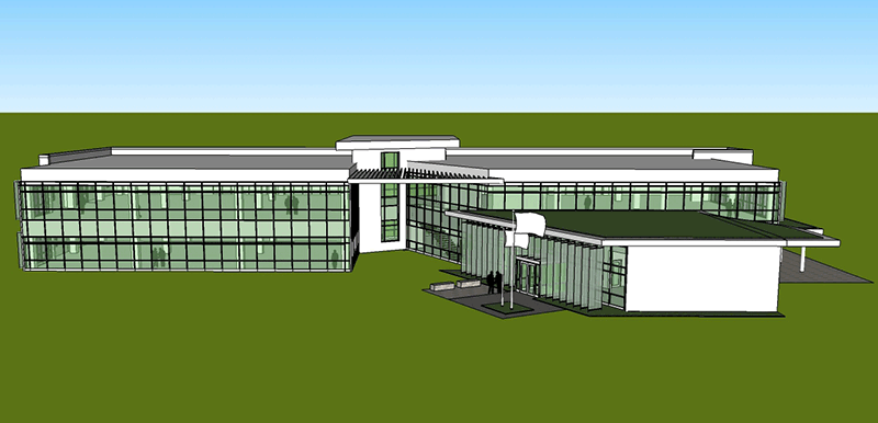
This office building was design to house the administrative staff for a central Illinois energy company. Forced to relocate offices from an existing space that both was too small and would be affected by a planned plant expansion, the Owners decided to build a new, green office building on an adjacent property.
Detailed Project Description
While beginning with office planning standards, the design challenged and nuanced those assumptions based on the specific needs of the client and their sustainable objectives. Typical office buildings, for instance use a 30 foot column bay. In this project, that standard was appropriate for the east-west dimension. But in the north-south dimension, the 30 foot dimension was reduced to 20 feet at the north where only indirect daylight reaches the building windows. Similarly, office buildings typically use central circulation to serve office space on either side. The result is often a concentration of elevators and stairs at the center of the plan. In this case, however, the that area was left open to become a central gathering point, a place where the different departments that necessarily must have their own space can come together and reinforce the corporate identity. The result is a building that recognizes efficiencies and standards, but works to customize those to the Owner and their needs.
Sustainable Characteristics
- Building Configuration - The design utilizes punched openings paired with enclosed offices on the north side of the floor plan to ameliorate the affects of cold winter winds. This contrasts with the south side, where extensive glazing and an open office plan maximize daylight and views.
- Controlling Daylight- A key element to the building's design is the combination of vertical and horizontal shading devices that help limit summer sun penetration into the building (which creates glare and unwanted heat gain). Complementing these shades is an interior light shelf that reflects daylight deeper into the building's interior.
- Electric Lighting - Lighting was planned very carefully to maximize energy efficiency. It begins with daylight sensor that automatically dim interior lighting (thus saving energy) whenever sufficient daylight is present. In addition, flourescent and LED fixtures result in a light power density of less than 0.60, almost 50% better than the industry standard.
- Green Roof - At the one story portion of the building that houses the Lobby and Reception, a green roof serves as both an amenity to the office staff that overlook the roof while also helping mitigate some of the rainwater coming off the roof.
- Enhanced Thermal Envelope - The building envelope incorporates high performance design strategies including four inches of rigid insulation outside the building framing, studied detailing to minimized thermal bridging, and carefully selected window systems and glass.
Services Provided by CWDesign
CWDesign was a consultant to project lead Ingenii Engineering and Area 39 Architects. In that capacity, CWDesign contributed to architectural solutions including the sustainable strategies outlined above. We also were tangibly involved in the drawing process, contributing design and technology advice on building sections and details including product research. In addition, CWDesign was actively involved with the development of the mechanical, landscape and civil strategies for the project, helping ensure that consultant designs met the Owner's sustainable goals.
Gallery
Project Summary
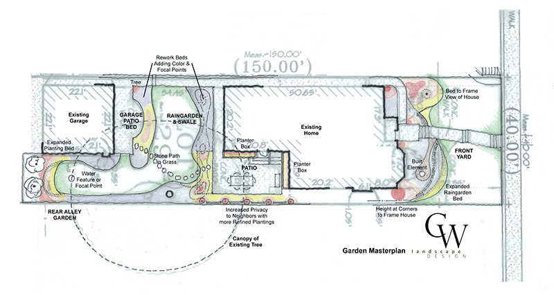
This Masterplan study for a garden represents how a garden that has already been developed to a degree, but has become bit overgrown and overwhelmed by a couple aggressive plants, can be quickly studied to see how it could be supplemented and refined in order to be more beautiful and better serve the homeowner.
Detailed Project Description
This planning process broke the larger garden down into five more manageably sized areas with distinct planting needs and use areas. In the front yard, goals included updating existing beds and providing plantings that better framed the home to accent the wonderful architecturally detailing. In an existing rain garden, plant diversity was expanded with specimens of contrasting leave color and texture and plans for an overflow drain were added to better manage heavy rains. At the patio, more intimacy was developed while also creating more plantings against the house itself to soften the built form. And in the back alley bed and the garage beds, diversity of plant color, texture and bloom times is expanded with a primary emphasis on creating views from inside the home and also from the patio.
Sustainable Characteristics
A key focus of the design process was addressing an existing rain garden that was regularly overwhelmed by rains. The solution expanded the beds capacity by enlarging it at deepening specific area so it could hold more water. An piped overflow was also added so that even during the most intense downpours water had a path other than across the sidewalk and patio.
Services Provided by CWDesign
- Design
- Teaching in the Garden
Gallery
Project Summary
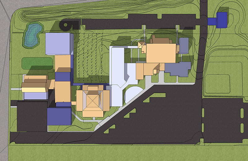
This project was an effort to comprehensively analyze campus needs across the full spectrum of Parish groups - from the Worship Space to the School to the Living Space of the priests. The result was a program of over 125,000 square feet that was planned for execution in a five phase masterplan.
Detailed Project Description
This project was a detailed analysis of a growing campus in an area that was becoming increasingly commercial. The challenge was to meet the needs of the Parish while developing four key concepts in that planning: (1) Image - create more visibility from primary streets to define the campus to the community; (2) Identity - use a shared plaza to create a common front door and entry sequence to create a sense of community and shared space; (3) Connection - create internal circulation that is easy to understand and clear; and (4) Exterior Space - use the buildings to define new exterior spaces like a new cloister garden and embrace existing ones like the cemetery.
Project Components
- New Gymnasium
- Preschool Addition
- Science Lab Addition
- Chapel Addition
- New Parish Center
- New Meeting Space Addition to the Worship Space
- New Eucharistic Chapel
- New Rectory
- New Parking Garage
Services Provided by CWDesign
- This project was worked on by principal Chris Wollmuth as an employee of Serena Sturm Architect, Ltd. He contributed as Primary Project Designer and Project Manager.
Gallery
Project Summary
In a recently purchased home, these homeowners faced a garden that had not received much attention in many years. While some plantings were worth building on, their overall goal was to bring new life to their landscaping.
Detailed Project Description
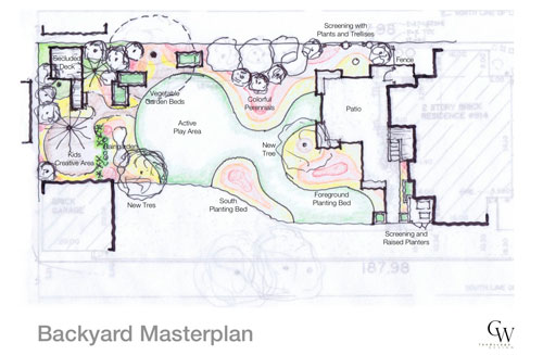
Addressing a very large garden can be intimidating. To make this backyard more understandable to the Owner it was broken down into three distinct areas: the patio, the middle garden and the rear garden. Each area has distinct goals which lead to unique features while also being framed by a larger vision of the yard.
One of the primary goals throughout the garden was creating planting beds so that existing views that bleed into surrounding properties are instead framed and contained to give the garden better identity. Another, related goal, was to layer the plantings so that sight lines which currently extend from the house all the way to the back fence are interrupted by focal points that let one appreciate the depth and extent of the garden.
Other features were more unique to this owner and site including; a secluded deck that would be ideal for having a cup of coffee or a glass of wine; a creative play area for the kids that includes a covered awning so kids can remain outside during light spring and fall rains; raised planters for vegetables that are easily accessible, yet not immediately adjacent to seating areas; and incorporating built elements - an arbor and statue - that are important to the owner.
Sustainable Characteristics
- Native plantings throughout to survive our dry summers without watering while also absorbing more water into the soil during rainy periods.
- Vegetable garden in raised beds so this vegetarian family can raise much of their own food.
- Raingarden to capture water off the roof and encourage its infiltration into the soil of the back yard rather than
- Reuse of existing awning frames both to shade the secluded deck and also to provide a covered play are for the kids at the north side of the garage.
Services Provided by CWDesign
- Design
Gallery
Project Summary
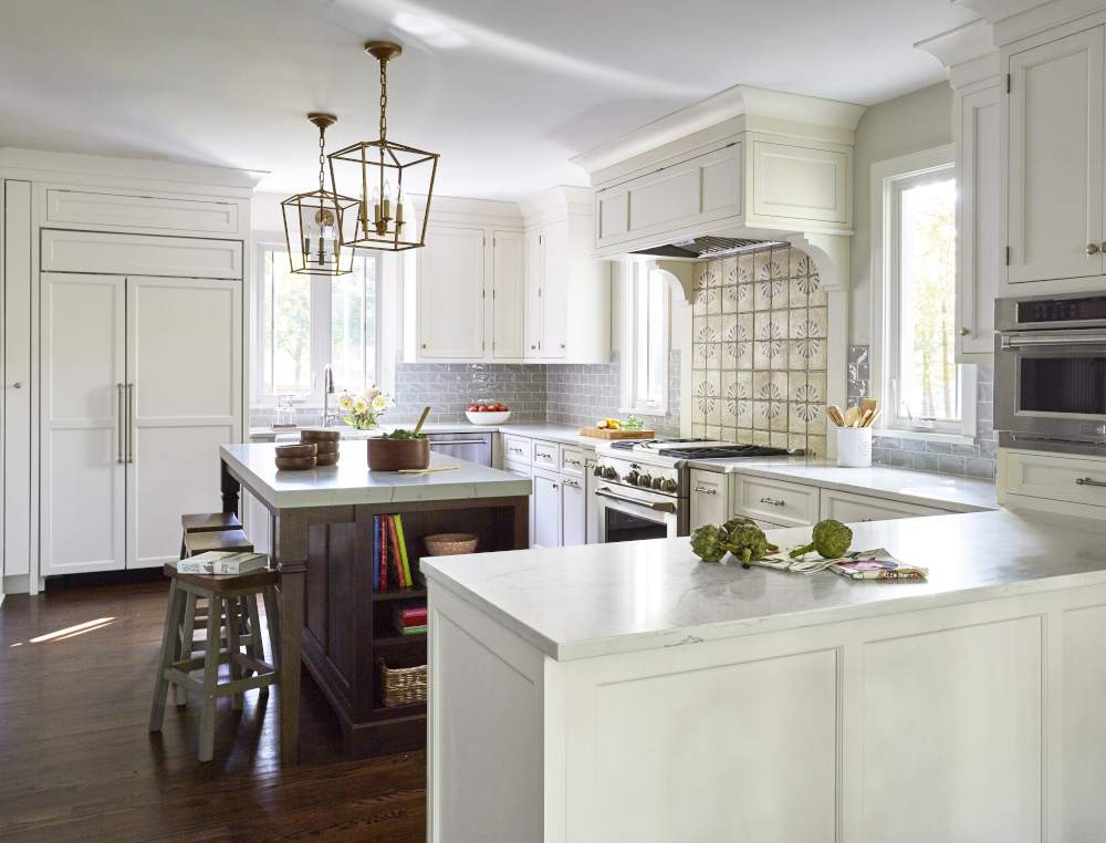
This family was originally looking at a small addition to renovate their Kitchen and add a Mud Room. But upon reviewing the possibilities, CWDesign was able to fit all their needs into the existing footprint by reconfiguring existing underutilized space. The second floor was also renovated, updating a current bathroom and adding a Master Suite.
Project Completion: 2019
Detailed Project Description
The homeowners began the project with two primary goals: renovate the kitchen, opening it up to the existing Dining Room and adding a Mud Room from the back entry, and renovating the second floor to create a true Master Suite with bathroom and walk-in closets. They were originally contemplating a small addition to accomplish the first floor renovation work. But CWDesign was able to show them how a reconfiguration of the existing spaces could maintain a Sitting Area and a Powder Room adjacent to the kitchen, while also opening the Kitchen to the Dining Room and adding a fully functional and beautiful Mud Room. The result is a space ideal for cooking and entertaining while also being comfortable and fluid for the family.
On the second floor, the existing master suite, which included only a tiny bathroom and minimal closets was also reconfigured to accommodate a full Master Suite with double vanities, a shower as well as a free-standing tub along with full “his” and “hers” walk-in closets. The existing single user Kids’ Bathroom was also updated from a single pedestal sink to dual vanities, extensive storage and open shower. A second floor Laundry Room was also added by knitting together two underutilized closets.
The overall result accomplished the Owner’s goals well within budget by avoiding an expensive addition in favor of carefully configuring existing spaces, and knitting them together to create the needed physical space while also creating the open, fluid feel the Owner’s wanted.
Services Provided by CWDesign
- Addition & Renovation Design
- Deck Design
- Construction & Permit Detailing
Project Partners
Jill Warren Design assisted the Owners with Interior Design
Grams Construction was the Contractor
Photos By
Michael Alan Kaskel Photography
Gallery
Project Summary
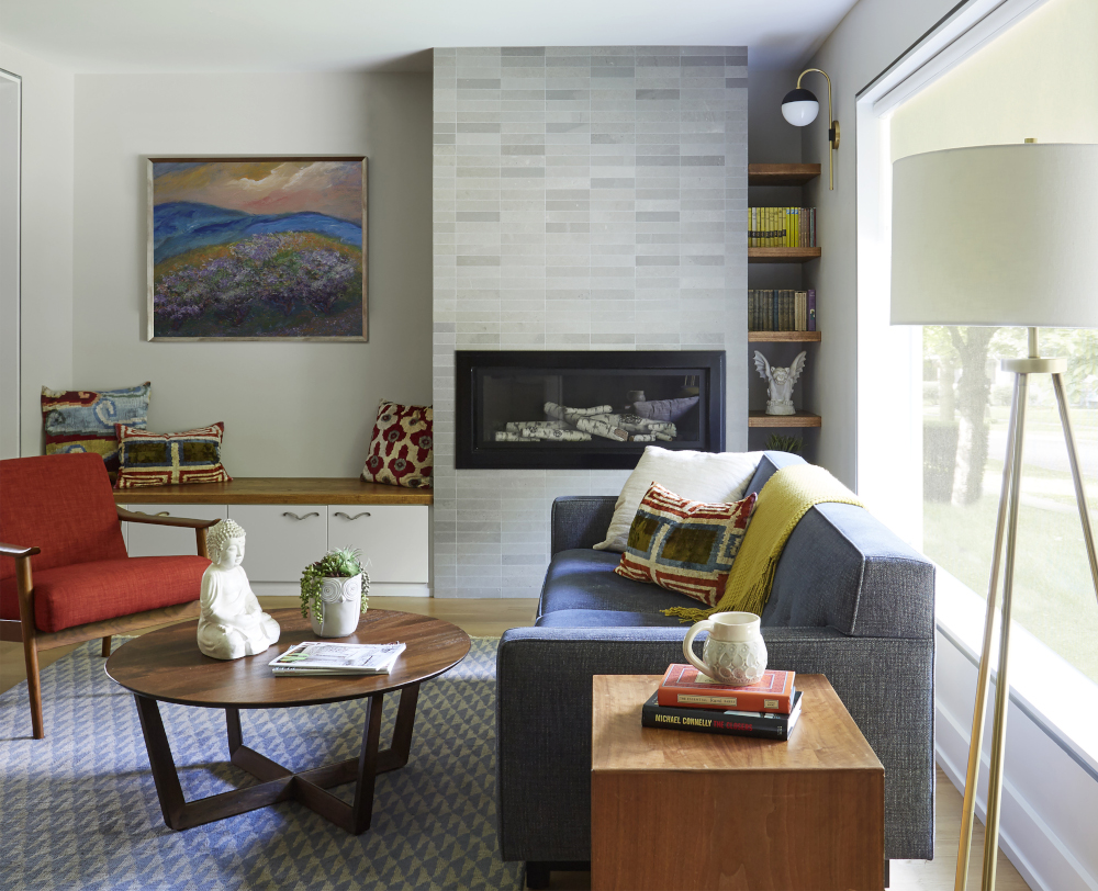
It’s not often one works on midcentury homes in Oak Park. But with a request to do just that, the Owners sought to completely gut a 1950s bungalow and renovate it in its original style.
Project Completion: 2019
Detailed Project Description
With the goal of downsizing from a large, traditional Victorian, the Owners wanted to maximize the space offered in this one-story home built in the mid-1950s. And while many would have thought to try and erase its midcentury charm, they wanted to embrace it.
Work began by opening the connection to the full basement with a new open, light filled stair. That created space for two bedrooms, a new bathroom and family room in the basement. On the first floor, the basic configuration didn’t change dramatically, but most every space was resized and tuned to better suit modern living.
From a more generous entry with a large closet, to an expansive living room, to an open kitchen with eat-in table, spaces were modified and windows added to bring daylight in and create open, flowing spaces. In addition, architectural details throughout the home, from reveals at door casing instead of face trim and kitchen cabinets that retain a more horizontal orientation rather that traditional vertical, reinforce the midcentury history of the home.
And, in perhaps the biggest surprise of the home, a wood paneled screened porch was added just off the Kitchen that provides a welcome transition from inside to outdoors and allows the home to breath in a truly unique way.
Services Provided by CWDesign
- Addition & Renovation Design
- Screened Porch Design
- Construction & Permit Detailing
Project Partners
Jill Warren Design assisted the Owners with Interior Design
Jacknow Construction was the Contractor
Photos By
Michael Alan Kaskel Photography
Gallery
Project Summary
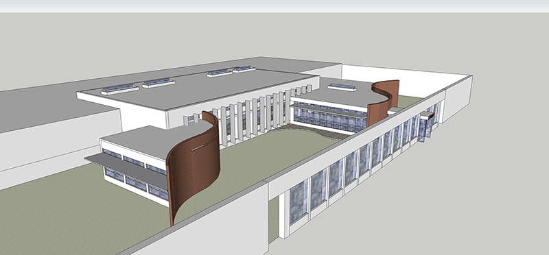
With an outdated Library, this high school was looking to create a new place to gather and share information. The result is a new Information Commons, a place to study and gather much like libraries of old, but one that recognizes the increasing competition libraries face from coffee shops and book stores as places to gather, linger and increase our knowledge.
Detail Project Description
Given that the very idea of a central library as a temple of learning and the home of books and is a somewhat antiquated idea with the internet and the access to information it provides, this high school wanted to reexamine what a library meant and what role it could and should play for the student body. In this instance, it meant that the Information Commons would retain some of the traditional roles it has filled for generations - a quiet place to study, and a home of books. But it's significance would also be defined by new roles - creating a place to learn how to sift through the abundance to find the relevant, a place to browse and discover new things beyond what a very specific search engine delivers to your browser, and a place to integrate the knowledge found from a variety of sources.
The analogy that resulted for the architecture was of a Boulevard - a place that brings people of many different interest and talents together, where people browse and explore, pause and linger and a place that is open and inviting. This was further reinforced by the location of this library at a hub in campus, a circulation node that connects spaces as active as the school cafeteria and a somber as a future Chapel.
Sustainable Characteristics
- The expansion spaces are oriented to allow for southern glazing where daylight can be more readily controlled. Where existing eastern glazing needed to remain, vertical shading devices will moderate unwanted glare and heat gain.
- The new construction, which will be located in an enclosed courtyard, will have berming against a variety of walls to create a balanced site, and thus avoid the need to move any soil out of the courtyard.
- Inside, LED and fluorescent lighting will reduce energy demand.
- Insulation will be added to the walls and roof to improve the building envelope and reduce energy usage.
- Carefully positioned skylights will reduce the need for electric lighting while balancing light levels throughout the space by balancing the large expanses of windows.
Services Provided by CWDesign
This project was worked on by principal Chris Wollmuth as an employee of Serena Sturm Architects, Ltd. He contributed as the Primary Project Designer, Project Architect and Project Manager from Pre-Design and Masterplanning through Schematic Design.
Gallery
Project Summary
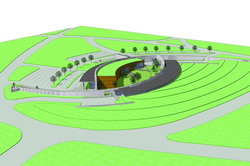
This project was a invitation only design competition to design a new Burial Chapel for All Saints Catholic Cemetery in Des Plaines, Illinois. The Chapel was to include three separate areas for celebration, as well as staff offices and support spaces.
Detailed Project Description
The project is based upon the allusion to a walled Japanese garden which creates the opportunity to develop a quiet, serene garden immediately adjacent to each Chapel while maintaining connection to the quiet calm of the sky beyond. To this end, it utilizes the wall opposite the chapel serves to reestablish the horizon line above the distractions and intrusions of other activities happening on the site.
To give form to the garden, the design references the ancient Christian symbol of the fish, known as Ichthys. The two arcs of the fish became the basis of the design as they are rotated from the form of the fish to create a shaping reminiscent of two overlapping hands sheltering a protected center. Three dimensionally, the arcs begin low on the site, being distinctly of the earth, but then rise, aspiring upwards as a symbolic pathway. Nested within them are the sacred spaces of the Chapels and the garden, insulated from the intrusions of the profane by the buffer of the support spaces opposite.
Sustainable Features
- The design orients the Chapels to face north, taking advantage of natural light that will avoid creating glare or unwanted heat gain.
- The offices on the north side are buried to the level of a clerestory window to both help moderate their temperature and also minimize their visual impact to visitors.
- The chapel has a green roof to similarly minimize the impact of the chapels to views from higher points in the cemetery near by.
Services Provided by CWDesign
This project was worked on by principal Chris Wollmuth as an employee of Serena Sturm Architects, Ltd. His role was that of Project Designer and Project Manager.
Gallery
Project Summary
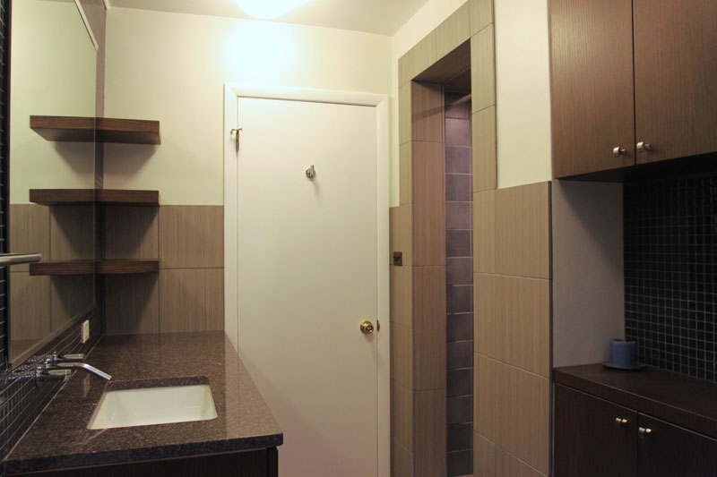
This 50s bathroom not only needed a facelift to update the finishes, it also needed a subtle reconfiguration to better serve two growing girls - a single pedestal sink with a small mirror wasn't going be enough.
Detailed Project Description
The design traded an existing linen closet that stood just inside the hallway door for a built-in cabinet that occupies a niche just opposite the toilet. That niche takes space from a living room closet that was too deep and had become a black hole for lost shoes. The result is an expanded vanity, room for a much larger mirror, and more efficient storage for both rooms.
The finishes selected are durable for the girls, but sophisticated enough to recognize that this is also the guest bathroom and should maintain the character of the rest of the home.
Sustainable Characteristics
- LED & Fluorescent Lighting
- Recycled Glass Countertops
- Reclaimed Wood Framing
- Dual Flush Toilet
Services Provided by CWDesign
- Architectural Design
- Computer Model
Project Summary
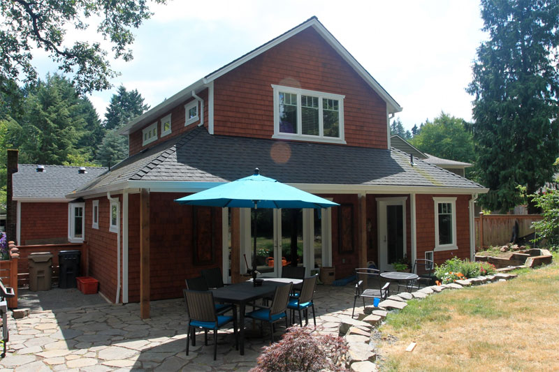
This project includes a two story addition that houses a new Great Room which combines an open kitchen with a family room on the first floor and a new master suite on the second.
Detailed Project Description
By removing the back portion of the home, which included a narrow shotgun style kitchen and mud room, space was created for an addition that transformed the home from living quarters that were small and cramped to a home that is spacious and bright for this growing family.
The result is a new Great Room with kitchen and family room open to one another. These link to an exterior stone patio through full glass doors with glass side lites. Paired with a covered porch that runs nearly the full width of the home, the result creates a strong link and good flow between inside and out.
On the second floor, a master suite overlooks the back yard. It includes walk-in closets, a bathroom with two lavatories and a separate room for the toilet and shower.
Sustainable Characteristics
- Bamboo Flooring
- Fluorescent Lighting
- Composite Countertops
- Thermally Insulated Windows
Services Provided by CWDesign
- Architectural Design
- Interiors Consultations
Gallery
Project Summary
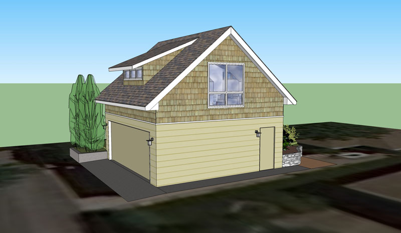
This renovation will add a second floor to an existing garage that will be accessible from the backyard. It will provide a second family room of sorts for use during summer entertaining.
Detailed Project Description
Given the small yard, the priority was to keep the addition from overwhelming the yard and the nearby house. The design therefore rotated the gable from the expected east-west orientation, to a north-south orientation. Thus the low edge of the roof, and smaller scale of the clerestory window to face the house rather than the tall peak of the gable.
Inside, plentiful daylight comes in from all sides. The light on the east and west, where the sun is low on the horizon as it is rising and setting, is managed by deep overhangs. In addition, low awning windows on the south paired with a high awning window on the north, along with operable clerestory windows will provide generous cross-ventilation to the space. Finally, generous ten foot ceilings are made possible by exposing the roof cross braces, which will conceal light fixtures to provide indirect light throughout the space.
Sustainable Features
Planning for natural ventilation
Carefully planned overhangs to manage direct sunlight
Fluorescent lighting
Services Provided by CWDesign
- Architectural Design
- Computer Renderings of the Design
Gallery
Project Summary
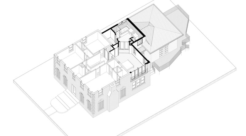
This Master Suite addition will occupy what was is currently an area of flat roof over a kitchen and study. It will give the Owners a master bedroom and bathroom more in tune with today's standards for space and amenity.
This project was designed and produced in partnership with Studio Talo Architecture.
Detailed Project Description
On the exterior, careful attention was paid to roof lines to avoid unnecessarily disrupting the existing cement tile roof. Similarly, the primary cladding will be stucco to match a previous addition, but a brick pier at the corner of the addition will frame the stucco and link it back to the main house to help blend the addition into the original home.
An important internal planning idea was to maintain an open plan. This allows for site lines from one side of the house to the other, which enhances a sense of spaciousness. It also allows for good cross ventilation from a new juliet balcony with sliding doors, through the bedroom and bathroom, and out clerestory windows above the bathtub. Finally, even with a plan that is very wide, the open views and connection between spaces will bring light into the bedroom from three sides, creating warm and welcoming atmosphere in the room.
Sustainable Features
- Daylighting
- Natural Ventilation
- Services Provided by CWDesign
This architectural design was developed and produced in partnership with Studio Talo Architecture, Inc. It recently completed Schematic Design, and is being priced by a local contractor prior to moving forward with more detailed drawings.
Gallery
Project Summary
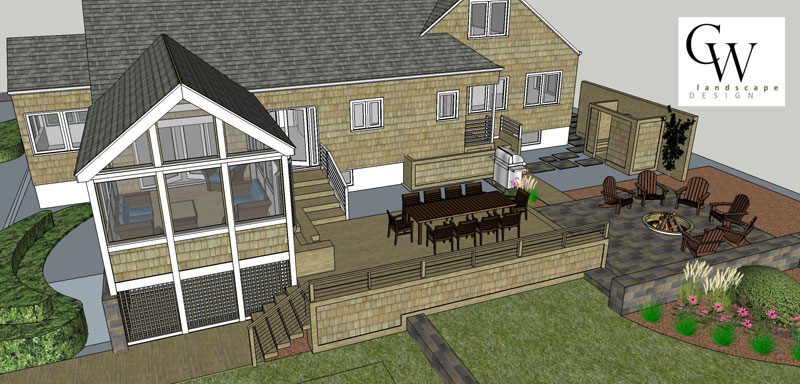
Having recently purchased a vacation home near the lake in Michigan, this family wanted backyard that would both serve their own needs while being an accent for potential renters. The result was a screened porch, patio, bbq and outdoor shower to entice owners and guests alike.
Detailed Project Description
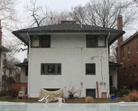
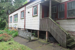
As can be seen from the photo of the original home shown below, the inside was cut off from what is really a spacious backyard with a lot of potential. The question was how to best link the kitchen and living spaces to the yard through a combination of a screened porch, deck and patio space.
The solution allows the exterior spaces to cascade from the house down into the yard through a gradual transition of partially enclosed spaces to completely open outdoor areas. The first step was to locate the screened porch off the Living Room. This allows for the seemless use of space as a new set of double doors can be opening allowing inside to flow directly outside. Functionally, the screened porch is complemented by a stairwell from the kitchen which allows quick access to the bbq.
The next step outside the porch takes you down a stair that doubles as built-in seating when the crowds get larger. These stairs work down to a large deck area, bounded on one side by a solid stone retaining wall and the other by plantings which soften the view back to the house. From there, a stone patio defines an area for a firepit, while only a short walk away is a more private and personally sized seating area for two out in the garden.
The result is an extension of the living space of the home into the backyard in a way that creates a variety of types of spaces for friends and family to enjoy as their mood dictates.
Services Provided by CWDesign
- Architectural & Landscape Design
- Permit Drawings
- Computer Modelling
Existing Home
Gallery
Project Summary
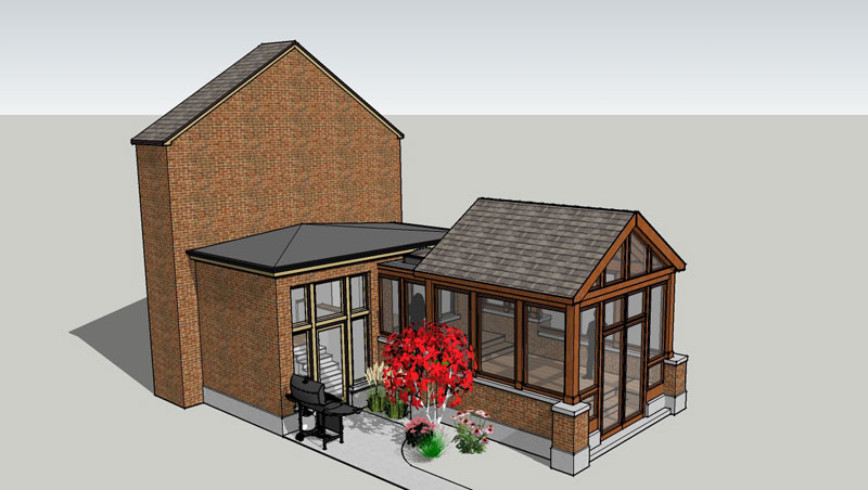
These homeowners, who already had a beautiful deck with masonry knee walls and limestone caps, were looking to provide some shade and enclosure after losing a significant tree in their yard. Unsure whether a pergola or a screened porch would be better, CWDesign developed both in a three dimensional computer model to let them see it in place.
Detailed Project Description
In looking to provide some cover to an existing back porch that had previously been shaded by a recently removed Elm tree, these homeowners were unsure how to proceed. They wanted to keep the natural light into the adjacent rooms of the home, but wanted some degree of enclosure when outside. They like the idea of a screened porch, but were concerned that it would cut off too much light to the home. A pergola was enticing because of the more filtered light it provided, but they were interested in occupying the deck during our light spring rains when it is warm and comfortable outside even during showers, so were unsure if a pergola would work.
As a result, CWDesign explored both options for them, and even looked at a couple of different iterations for the porch...one with a hipped roof (low on all sides, like their garage) and two with gabled ends (with a peak on two sides, like their home.)
CWDesign also consulted with a contractor, using special views of the model like the section above, to get preliminary cost estimates for both the options so that the home owners could also understand the resources need to make each a reality.
In the end, the homeowners were able to see the different options, understand how each related to the house and even get a better idea of the affect on the natural light to areas inside the home. The were able to do all this within the framework of the costs associated with the different options to better inform their decision moving forward.
Services Provided by CWDesign
- Pergola & Screened Porch Design
- Three Dimensional Computer Modeling
- Coordination of Contractor Pricing
Gallery
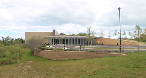
Greenbelt Cultural Center
Tasked by the Owner to provide a "visible statement of sustainability", the design that resulted ended up being much more subtle. The design was generated by carefully considering the most elemental properties that were existing on the site - the sun, the earth, air, water and plants. Rather than designing a building and then trying to replicate the benefits of each of these elements, the building was conceived around the very benefits each of these offer us.
Programmatically, the task was to renovate an existing large Program Room into two classrooms to serve the educational needs of the Forest Preserve. The addition and expansion then provide a new, larger Program Room that was divisible. The Program Room was to be multi-functional, with the ability to host everything from classes of kids to professional meetings to weddings. Accompanying the Program Room is an expanded Art Gallery and circulation space that doubles as a Pre-Function area.
Sustainability
While not striving for any type of sustainable certification, the goal of this project was to be an example of sustainable design. To that end, careful resource development was fundamental to the planning process and included:
- Sun - South facing glass paired with concrete floors and masonry walls creates Passive Heating; Carefully placed windows and skylights combined with external shading devices bring in natural light while limiting heat gain and glare; The lighting system within has integral sensors that automatically dim or shut lights off when enough daylight is present and electric light is not needed.
- Earth - The earth is bermed up against the building in an existing amphitheater to moderate the building temperature throughout the seasons. Geothermal heating and cooling temper the building in all season using only the natural temperatures of the earth. A Green Roof covers a portion of the low roof area helps absorb rainfall, provides additional insulation value and extends the life of the roof membrane.
- Air - Natural ventilation is encouraged as operable windows paired with solar and wind powered fans high on the building draw air through the building. Displacement Ventilation is incorporated so that the natural stratification of the air serves to clean the air inside the main meeting space.
- Water - Stormwater detention is incorporated as a feature of the site, even being incorporated into the Owner's education program. High Efficiency fixtures are used, with both sensor activated faucets and dual flush toilets saving water.
- Plants - In perhaps the building's most unique feature, a vertical hydroponic garden integrated into the mechanical system uses plants to clean the air which reduces outside ventilation requirements (the tempering of which is one of the largest energy uses in commercial buildings.)
The overall result is an energy usage 72% better that a standard building, and one in which daylight will be the primary light source in lieu of electric lighting.
Services Provided
This project was worked on by principal Chris Wollmuth while an employee of Serena Sturm Architects, Ltd. He contributed as Co-Project Designer, Project Architect and Project Manager from Pre-Design and Masterplanning through the final stages of Construction Administration.


